|
In this portion of the logo design process, I was asked to make 3 variations of the logos I had designed before. The most challenging part of this project was brainstorming of how I could make my logo better. Also, another challenging part was changing the size of the logo; I had designed my logo to be big and hence made each of the logo on three different Gravit pages. But when I had to put all three logos on one page to make variations of them, it was difficult to adjust the size. My favorite process was designing the logo on paper. Something I learned from this whole process is that logo takes a long time to create, and to be higher quality, it could take even more. 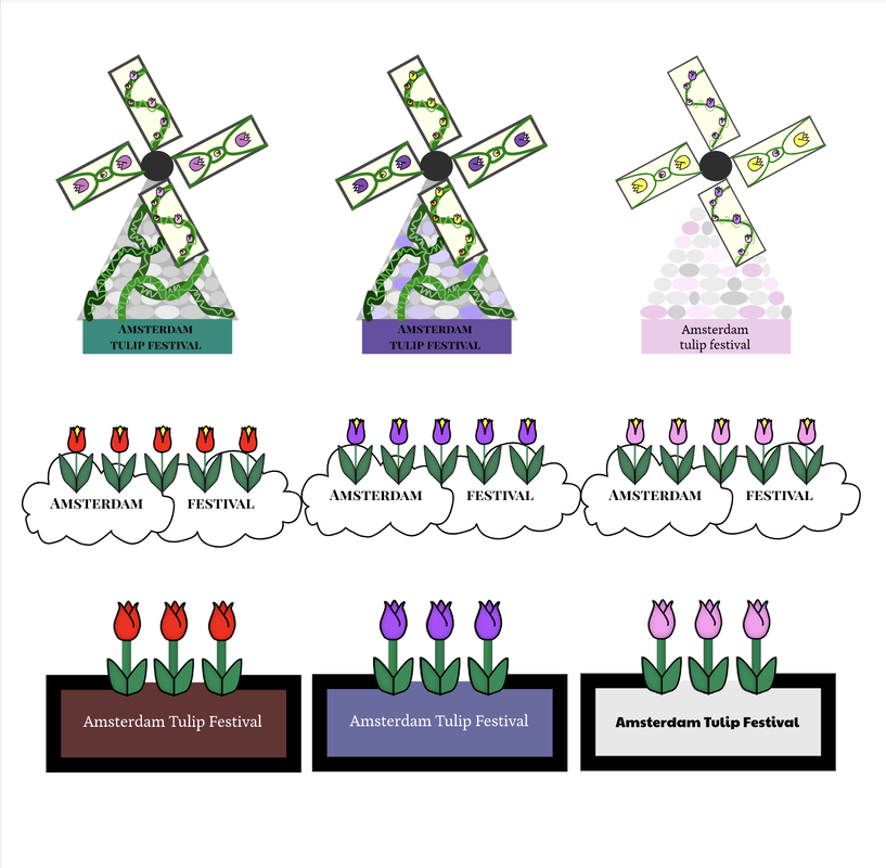 The brand of this log is Amsterdam Tulip Festival. It was originally not supposed to be a brand, but rather a festival's name. This brand is an organization that opens Amsterdam Tulip Festival every early spring. This is an actual festival that occurs in Amsterdam, the capital of the Netherlands. The logo which I created represents this brand by having tulips as the main drawing in the three different logos. The logo under this paragraph is my favorite one because it is simple, but pretty at the same time. 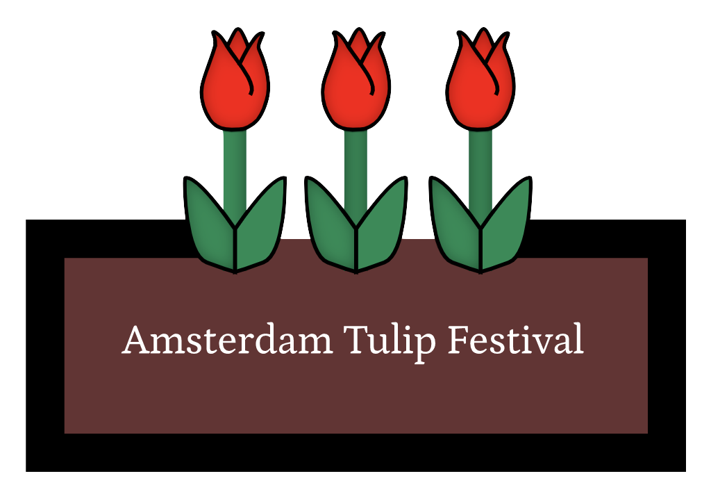
0 Comments
My logos, which include a lot of tulips, represent the Amsterdam Tulip Festival. This festival allows people to enjoy the fragrance of flowers and its beauty. The three logos I chose are the tulips on the clouds(right hand side), windmill covered in flowers(bottom-left corner), and finally, the one next to the windmill drawing. The images mainly symoolizes variety of tulips that would be in the festival. It also shows a glimpse of its beauties. I enjoyed brainstorming my logos, for it was a new experience. However, when I was close to making ten logos, I started to run out of ideas, and was frustrated.  In the Color Theory Summative Project, I was asked identify various colors' hex-codes and the RGB. During this project, I used Google Color Code Picker, to identify the colors' hex-codes. This Color Code Picker told me things such as the RGB number and the hex-code to whichever color I picked. I was able to control the brightness or the shade of the color, and whichever color I picked always had a hex-code and RGB number. Another useful website that I used during this project is Adobe Color. In this website, I was able to find the four different color palettes that I was asked to find. Some struggles I faced during this project was when I was had to pick only four color palettes when there were so many beautiful color palettes I saw. Lastly, I was able to trace this beautiful paper airplane drawing because of the paper airplane drawing. Color Names Color Schemes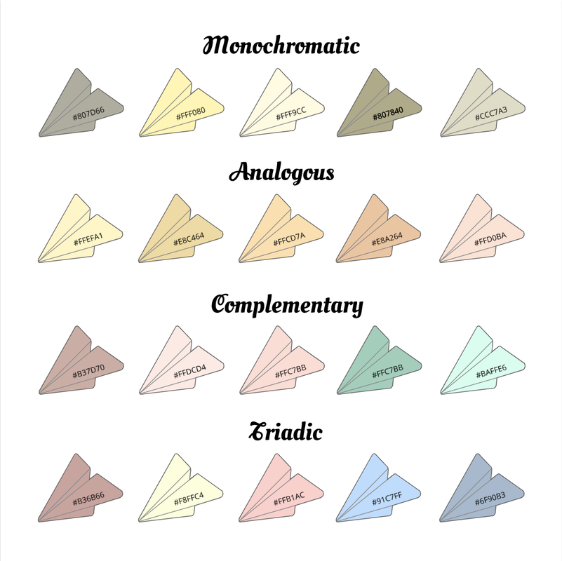 In this unit, we learned the importance of typography and found out different personalities of each fonts. The definition of typography is the design of the word, which makes the mood of the font. Typography is important because each designs of the words makes different feeling from the text. The quote "Each font has a personality and a purpose" clearly sets an evidence of this. This quote means that according to the font, the purpose and the personality of the word becomes different, too, since each font has a different personality. The first font we learned in class is Serif, which has a "feet" on the edges of the font. Serif is usually used when printing large blocks of text. The second font we learned in class is San Serif, which does not have feet at all. San Serif is usually used for smaller chunks of text, such as titles and headlines. The third font we learned in class is Monospaced, which each letter has the same amount of space. Monospaced fonts are usually used in smaller blocks of text, such as coding since it has a lot of spaces between the fonts. The fourth font we learned in class is Script/Handwritten, which looks like our normal cursive, calligraphy, or hand-writing. Since they are sometimes hard to read, they are usually used in logos or large headlines. The last font we learned in class is Novelty, which immediately grabs the audience's eyes due to its uniqueness. They are usually used sparingly and its popularity comes and goes. Typeface Comparison For the Typeface Comparison activity, I was asked to use same words but different fonts to compare the different styles of the fonts. I also used skills we learned in previous lessons such as alignments to make sure the fonts were in given the same setting to get compared. 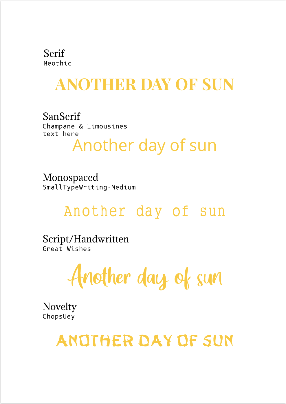 Word PortraitsFrom the Word Portrait activity, we used the complete opposite logic of Typeface Comparison. We used different words, but same fonts to see what fonts go along with the words. By this activity, we learned how according to the different atmosphere the word has, you should use different styles of fonts. 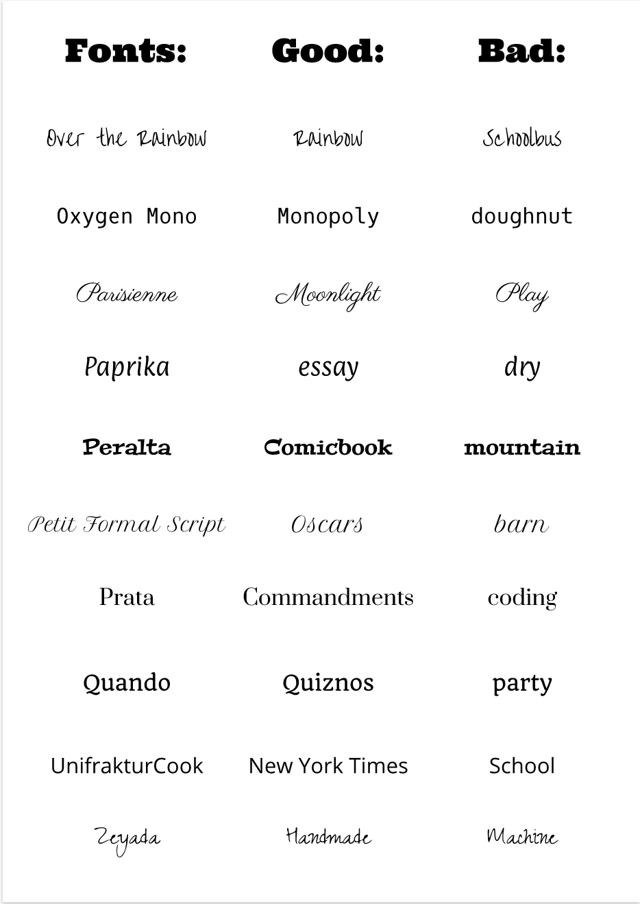 In these three exercises, I was assigned to trace variety of shapes and logos using Gravit. To do that, I used Pen Tool. A Pen Tool is tool which allows you to trace which ever shapes you want and cut it out. It could cut out any shapes, since you could use the option key and the shift key to change directions and the curve of the cutting line. My final illustration using Pen Tool is a California flag. The original flag has a grizzly bear on its center, but I changed the bear with Winnie the Pooh and his honey. Image Sources: Honey, Winnie the Pooh, California flag Challenge I faced during this project was combining three picture on one page. However, I kept trying different ways and succeed at last. 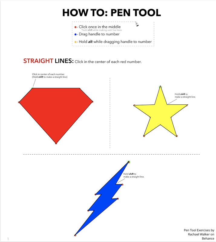 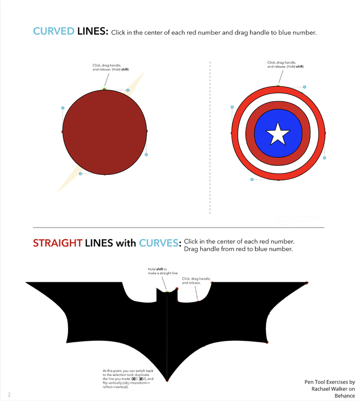 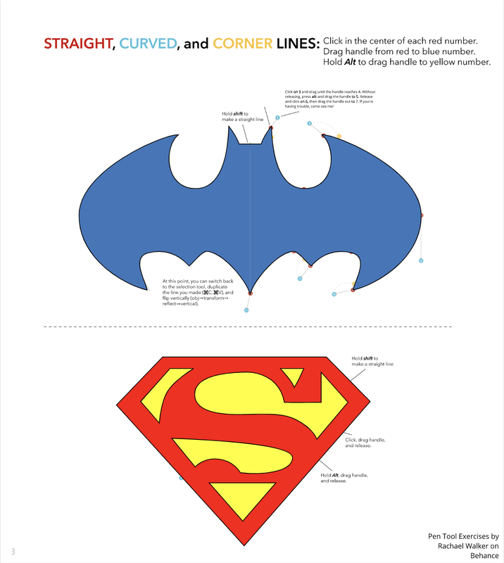   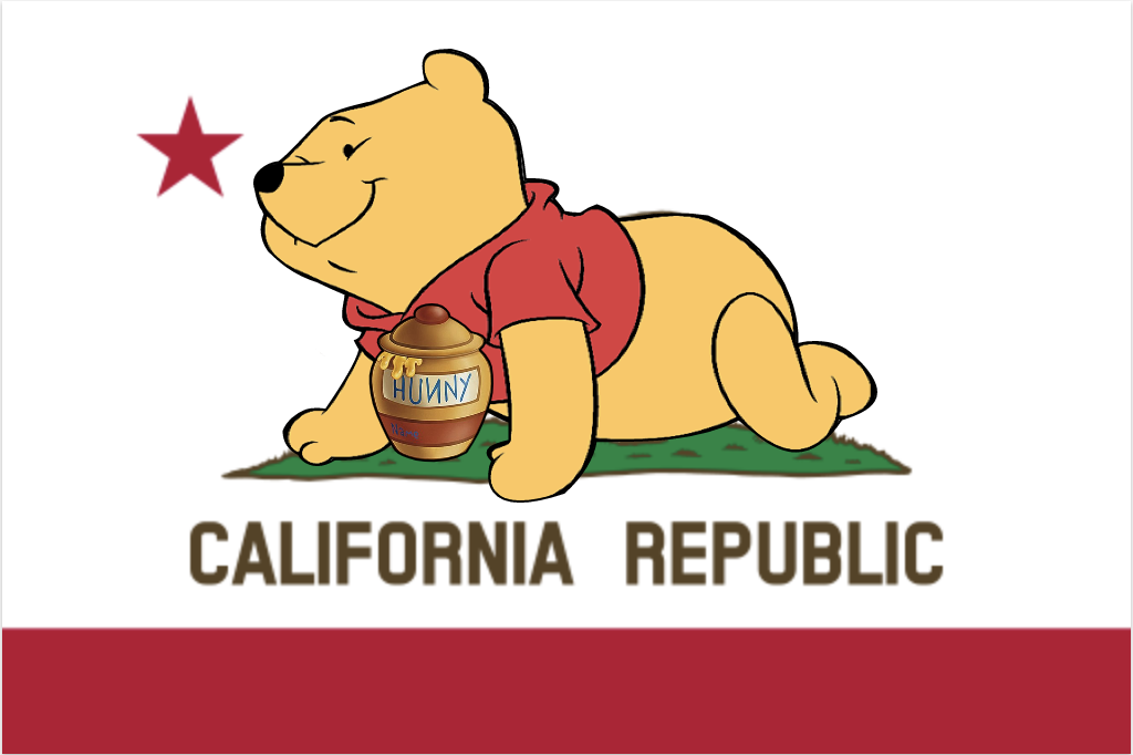 This is an image representing Jesus and sunlight. I drew these two because I like God and warm sunshine, including the clear, blue sky. From this Hour of Code activity, I learned how to create various shapes and how to change the colors of the shapes. This activity gave me a new aspect of JavaScript, which I have no experiments of learning. Different from my previous aspects of coding, this lesson gave me an impression that we could express our feelings into coding. 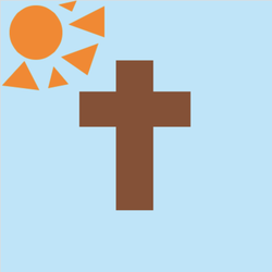 background(182, 229, 250);
noStroke(); //botton rectangle fill(140, 78, 49); rect(170, 185, 55, 124); //top rectangle rect(170, 88, 55,100); //left rectangle rect(116, 134, 80, 52); //right rectangle rect(200, 134, 80, 52); fill(255, 132, 0); //sunshine ellipse(52, 47, 78, 80); triangle (112, 0, 105, 16, 85, 6); triangle(144, 63, 89, 83, 128, 110); triangle(70, 129, 100, 123, 78, 97); triangle(153, 54, 100, 35, 153, 8); triangle(2, 125, 35, 89, 57, 132); This art work is about my dog, Ka-ul. I have chosen my dog who is no longer by my side because he was a very meaningful memory to me. Although I had met some struggles trying to resemble Ka-ul's twinkling eyes, it was hard to imitate it just with shapes. I wanted to add some realistic features into its beautiful eyes, so I tried adding multiple layers of circles and different colors to make it more alive. I hope to see Ka-ul again one day. 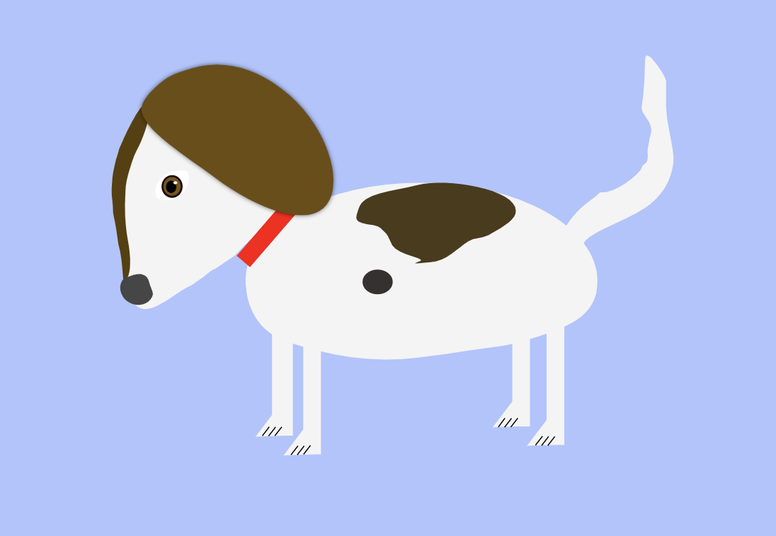 In this lesson, I learned how to make different designs from shapes. Utilizing techniques such as Union, we learned how to control the appearance of our shapes. We also learned how to control the shape's corner, points, and size. 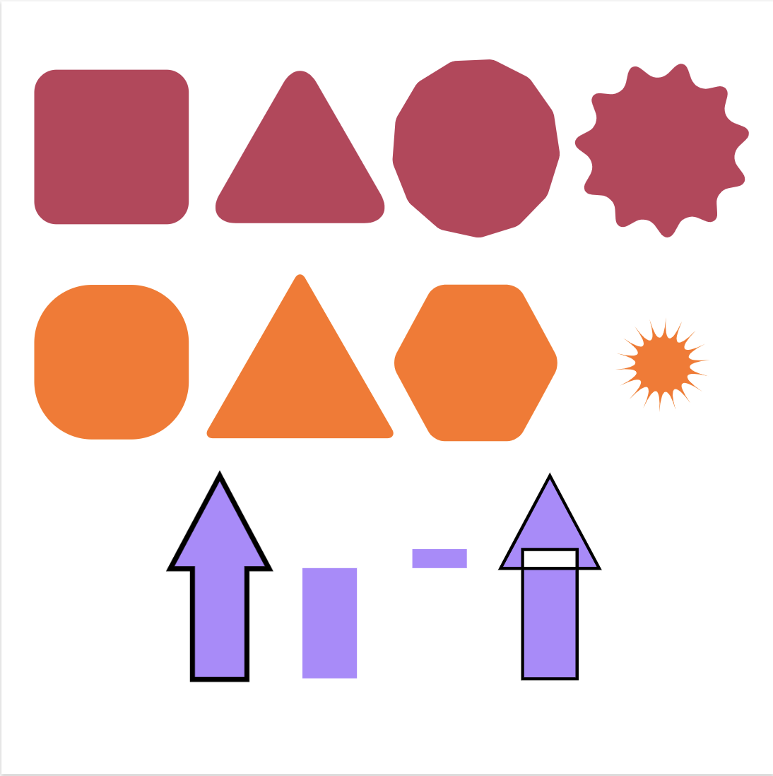 In this lesson, I learned how to align the objects and how to duplicate the objects easily. We learned these with various key board shortcuts. 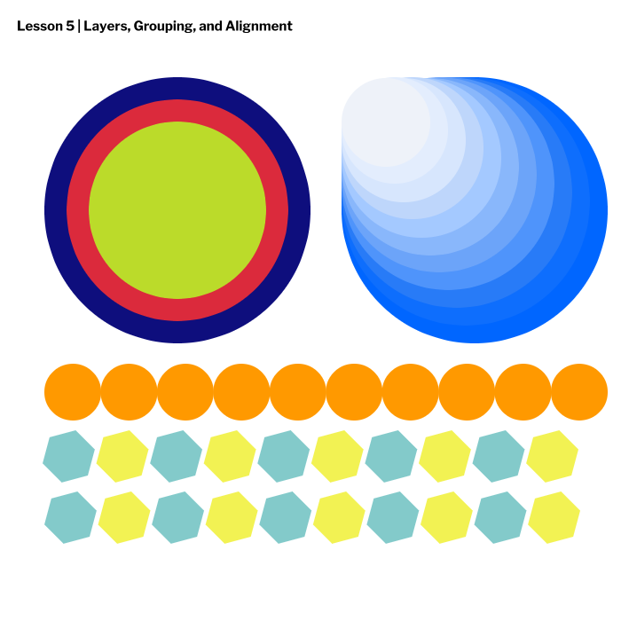 In this lesson, Fill and Borders Worksheet, I learned how to control the fill, borders, and dashed lines of a shape. I also learned how to control the transparency (also referred as opacity) of a shape. 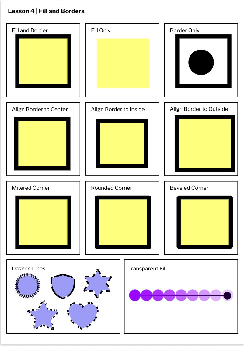 |
About me!Hi, my name is Emily! I like to play my viola, spend time with my family, and read books. Archives
April 2020
Categories
All
 This work is licensed under a Creative Commons Attribution-NonCommercial-NoDerivatives 4.0 International License. |
 RSS Feed
